Play Training
Overall Performance
Introduction 2 of 6
Exploring the Overall Performance Area in TapClicks
The Overall Performance Area within TapClicks provides a comprehensive overview of a campaign or channel's performance, focusing on key metrics such as impressions, clicks, and click-through rates (CTR).
 Related How To Guides:
Let's delve into the various elements of this area to better understand how it aids in monitoring and analyzing overall performance.
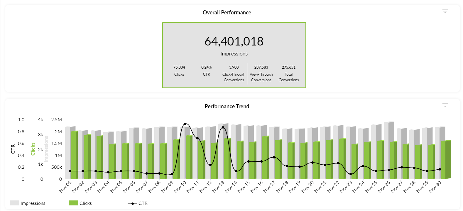
Performance Graph
The Performance Graph is a visual representation of the campaign or channel's delivery (impressions), engagement (clicks), and response rates (CTR) over a specified time period. Graphed on a daily basis, it allows users to track trends in impressions, clicks, and CTR simultaneously. This combined chart provides a quick glance at the overall percentage total for each reporting metric on a given day.
Click-Thru and CTR Line Graph:
The Click-Thru (Click-Through) and CTR Line Graph is a dynamic feature that plays a crucial role in monitoring trends in engagement and highlighting overall performance. This graph visually represents the correlation between clicks, click-through rates, and the overall effectiveness of the campaign over time.
Top Metric Area
The Top Metric Area is a consolidated box displaying the most important metrics, offering a quick snapshot of campaign performance.
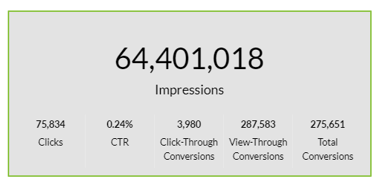
Key metrics included in this area are:
- Impressions: The total number of times an ad is displayed.
- Clicks: The number of clicks directly on an ad.
- CTR: The percentage of clicks compared to the total impressions.
- Conversion Rates: This includes:
- Click-Through Conversion: Conversions occurring after a user clicks the ad.
- View-Through Conversion: The number of users exposed to an ad who later visit the advertiser's website.
- Total Conversions: The cumulative sum of click-through and view-through conversions.
Understanding each metric in the Top Metric Area provides advertisers with valuable insights into the effectiveness of their campaign. Whether focusing on engagement, conversion rates, or overall impressions, this area serves as a centralized source for essential performance indicators.
In summary, the Overall Performance Area in TapClicks serves as a powerful tool for advertisers, offering a comprehensive view of campaign performance through intuitive graphs and key metrics. By understanding impressions, clicks, and conversion rates, advertisers can make informed decisions to optimize their campaigns for better results.